Design frameworkfor usable products
Est. 2016used by teams worldwide
Five principlesin every UX review

BASIC UX

A shared language for testing, refining, and agreeing on a product's user experience.

Scroll to explore

The framework

A concise set of principles that test something's overall user experience.

While information about good UX is in increasing availability, teams, organizations, and individuals still struggle to define, measure, and agree upon principles of user experience in a productive manner. A lot of UX discussions end in opinion-based design arguments. This causes frustration for the people building a product, and ultimately leads to a sub-par experience for its users.

BASIC UX addresses this by providing a concise set of UX principles for guiding a product's usability design: Beauty, Accessibility, Simplicity, Intuitiveness, and Consistency. Within each principle is a set of questions for testing and analyzing a design. With these standards in place, teams can objectively test, refine, and iterate toward a superior experience.

BASIC UX Framework Infographic - Beauty, Accessibility, Simplicity, Intuitiveness, Consistency principles
The BASIC UX framework at a glance
5Core principles
18Questions to ask
2016Established
1Shared language

The five principles

Five lenses to test any experience.

Beauty

Is it aesthetically pleasing?

The look and feel of a product matters to the overall experience. The Aesthetic-Usability Effect shows that a visually appealing design is perceived as easier to use than an unattractive one. Designers should refer to style guides and design specs for a product's look and feel. A few minor details can make a design look off and make the whole product feel broken.

Questions to ask

  • Is it aesthetically pleasing?
  • Does it follow the style guide?
  • Are high-quality visuals used?
  • Is it properly aligned?

Accessibility

Can everyone use it?

A product's accessibility is the degree to which it is available and usable by people, regardless of ability. Designers must go beyond the average user and ensure that those with limited hand mobility, vision impairment or blindness, and other disabilities are also able to use the product.

Questions to ask

  • Can everyone use it?
  • Does it comply with standards?
  • Is it cross-platform compatible?

Simplicity

Does it make life easier?

Hick's Law states that the time it takes to make a decision is proportional to the number and complexity of choices. Ockham's Razor states that simplicity should decide between two otherwise identical designs. Interfaces should distill the options to only what is needed to perform the user's task. Visually, that means balancing white space and alignment to create associations rather than relying on complex graphics. The principles of Gestalt tell us that distance, alignment, and color similarity can guide a product in a clean, intuitive way. For language, it means reducing redundancy, passivity, and filler.

Questions to ask

  • Does it reduce the user's workload?
  • Is it free of clutter and repetitive text?
  • Is its functionality necessary?

Intuitiveness

Is it easy to learn?

The Gulfs of Evaluation and Execution (Norman, 1986) describe the gaps users face. Evaluation happens when a user interprets feedback to understand the product's current state. A clear path of execution is needed for a user to reach their goal. If either is unclear, the user will not know what to do, may repeat actions, or feel anxious that their task did not complete.

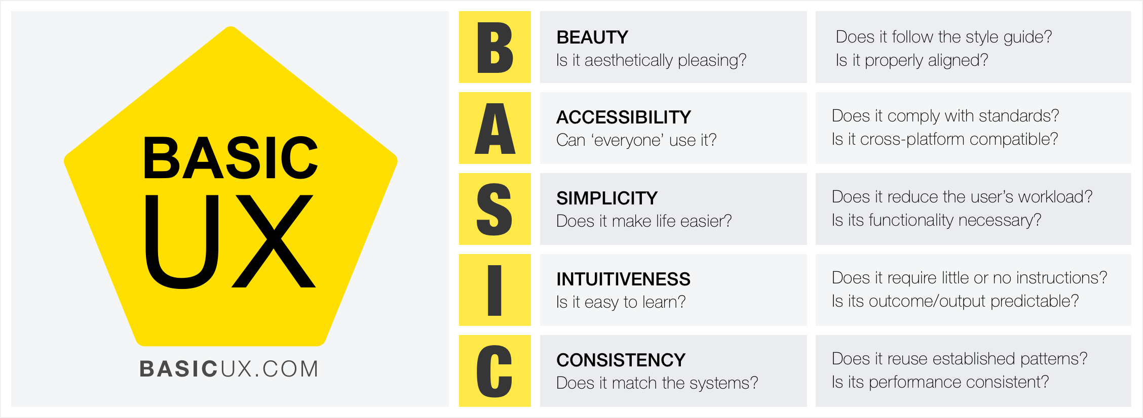
Intuitiveness in BASIC UX is about how learnable a product is. Very few things are innately intuitive. Using a pencil seems intuitive but is actually learned. The point is that a product can be learned and that users should not need to relearn it over and over. That learning should be as small an obstacle as possible. Affordance matters too: the color of links or the shape of buttons cue the user about what elements do. Most people spend most of their time in other products, so building on established patterns is key.

Questions to ask

  • Is the functionality clear?
  • Can the user reach their goal with little or no instruction?
  • Can the task be repeated without further instruction?
  • Can the user predict the outcome?

Consistency

Does it match the system?

Consistency is the thread that holds UX together. A beautiful product is consistent. An accessible product is consistent. A simple product is consistent. An intuitive product is consistent. In UX, consistency is what separates frustrating chaos from cohesive harmony. Colors, spacing, fonts, and alignment should stay consistent throughout the product. Reuse existing, established elements wherever possible. Forms should share alerts, labels, validation, and action behaviors. If consistency is lacking, the entire experience will be too.

Questions to ask

  • Does it reuse existing patterns and designs?
  • Is its language, imagery, and branding consistent with the system?
  • Does it appear in the right place at the right time?
  • Does it perform consistently every time?

Sources

The research behind the lenses.

New · For agents

BASIC UX for Claude, Cursor & Codex.

A skill that audits any screen against the five principles with Playwright and screenshots, so your agents score and improve the UX they ship.

Put it to work

Test your
product's UX.

Download the infographic View on GitHub

Run any product through the five lenses and turn opinion-based debates into objective, repeatable reviews.